Counterpunch: making movable type
In his book Counterpunch: making type in the sixteenth century: designing typefaces now the Dutch typographer Fred Smeijers tells how the pioneers of metal printing type adapted the technology of metal working and the aesthetics of lettering to make something new—the roman and italic type that you still see on this web page.
This is a wonderful book. To write it, Smeijers looked closely at printed books and type punches in museums. He read contemporary accounts of sixteenth century type making. And, informed by his experience as a digital type designer, he understood the problems the sixteenth century type makers faced and how they solved them. Some of these problems—like readability, economy and visual texture—are still with us.
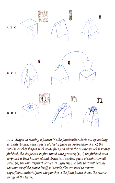
Most remarkably, he also taught himself to make his own steel type punches—his practical experiments shone new light on the subject and showed the implausibility of some accepted accounts of how things were done.
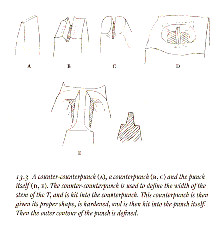
The book is engagingly written. It’s a visual delight too, with text set in the author’s Renard type and illustrated with his pencil sketches.