Department of Conservation sign
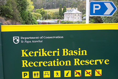
The Department of Conservation, called DoC by New Zealanders, marks its parks and reserves with clear and readable signs like this. The font appears to be ITC Garamond (my favourite among the many modern revivals of Claude Garamond's type designs). Most of the text is set in the bold weight. I only wish they would use a proper italic font for the Māori text (in either book or bold weight) instead of pushing the roman sideways like that. That’s nasty.
Update: Perhaps this was an isolated lapse, since I have seen lots of DoC signs with proper italics.
Update: Perhaps this was an isolated lapse, since I have seen lots of DoC signs with proper italics.
Taken 13 April 2004. Filed under
places and
signs. Click the photo to go to the previous photo.
< previous
next >