logo

Fingerspitzengefühl

Sunday 5 May 2013

I found this delightful German word in Oliver Reichen­stein’s fine piece Learning to see. He writes about design that combines functional and aesthetic value​—​You don’t get there with cos­metics, you get there by taking care of the details, by polishing and refining what you have. This is ultimately a matter of trained taste, or what German speakers call “Finger­spitzen­gefühl” (literally, “finger-tip-feeling”). He adds a photo of Jan Tschichold to illustrate.

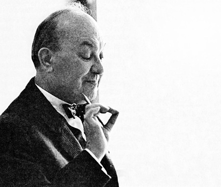
Photograph of Jan Tschischold, who oversaw the redesign of 500 Penguin paperbacks in the 1940s, designed the elegant and read­able typeface Sabon, and brought a refined taste and sensibility to the design of books and type. According to Linotype, Frank Bolliger took this exquisite photo of him in 1962.

filed under Design + Words

comment on this article by private email

Search marquis-kyle.com.au

Serendipity
Sally
Lucy
Pebbledash people
New word: NARU
Haircut blogs and other inventions

Monthly archive
2021 A
2020 O A J J M A M F J
2019 D A J
2018 O S A J J M A M F J
2017 D N O S A J J M A M F J
2016 D N O S A J J M A M F J
2015 D N O S A J J M A M F J
2014 D N O S A J J M A M F J
2013 D N O S A J J M A M F J
2012 D N O S A J J M A M F J
2011 D N O S A J J M A M F J
2010 D N O S A J J M A M F J
2009 D N O S A J J M A M F J
2008 D N O S A J J M A M F J
2007 D N O S A J J M A M F J
2006 D N O S A J J M A M F J
2005 D N O S A J J M A M F J
2004 D N O S A J J M A M F J
2003 D N O S A J J M A M F J
2002 D N O S A J J M A M F J
2001 D N

Subject archive
Archaeology
Architecture
Collecting
Conservation
Design
Environment
Food
History
Lighthouses
Maps
Me
Photography
Prints
Ratbags
Reviews
Society
Technology
The web
This site
Tools
Typography
Words

About marking time

RSS

©
Contact me