Marking time in August 2016
The quality of tags
The State Library of Queensland is asking people to tag photos in Flickr Commons—Pitch in! Become a digital volunteer.
Yes, I’m willing.
Tags are descriptive terms chosen by anybody and applied to a photo. Let’s take the example of a photo filed under headings like koala, or Phascolarctos cinereus, which zoologists would recognise as correct names. Zoologists would also allow descriptive terms like marsupial, or herbivore. But what about tags like bear, or cute, or cuddly?
Tagging is a good way to collect a range of understandings from many people with different points of view and different knowledge. Tagging can produce a useful and sometimes surprising range of descriptive terms. The librarians appear to be encouraging people to enrich the Flickr Commons by tagging. But I wonder if their heart is in it.
On the Pitch in! web page is a black and white photo of four young women working in a garden, with a headline Tag SLQ’s photos in Flickr Commons. Three coloured labels have been applied, apparently to show how tags can add value to photos.
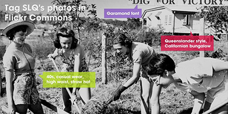
But, to me, these labels show the opposite—that tags can subtract value when they are wrong. As the nerds say, garbage in, garbage out. Was this done on purpose—part of a cunning plan to show that tags are unreliable?, that we should all stick to those proper Library of Congress Subject Headings?
The green label points to one of the young women and has the tags 1940s, casual wear, high waist, straw hat—which sound plausible but, since I don’t know much about women’s clothes, I won’t say any more about them.
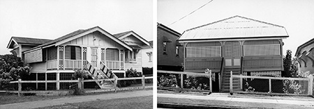
The red label deals with things I do know about. It points to the house in the top right corner and suggests the tags Queenslander style and Californian bungalow. The house is a single storey wooden house, with a hipped corrugated iron roof that covers the verandahs without a break—so yes, it is similar to many houses built in Queensland between 1900 and 1930, and there’s no harm in tagging it Queenslander style. (I don’t call houses Queenslanders, because that word’s meanings are too diverse and unspecific for my purposes.)
But the Californian bungalow tag is just wrong. This is a term with a particular and useful meaning. The standard reference lists these essential distinguishing features of the Californian bungalow:
- Visually prominent low-pitch roof
- Wide eaves overhang
- Exposed roof timbers
- Street-facing gable
The house in the picture has none of these essential features (nor does it have any of the 14 other features associated with the Californian bungalow style).
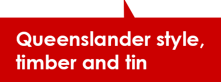
So the red tag should lose the line Californian bungalow. Adding the tag timber and tin would be useful (and correct). Like this:
The purple label points to the line of type, top right. It has the tag Garamond font. I won’t insist on calling it a typeface, not a font—I concede that battle. But it doesn’t look like Garamond to me. Claude Garamond’s name has been linked to lots of different typefaces but not the one in our picture. With a bit of research I found out what it is.
The State Library catalog tells us that the photo came from Queensland Newspapers Pty Ltd, but does not say whether it was ever published, nor in what newspaper. The photographer might have been working for The Queenslander, The Courier–Mail, the Sunday Mail, The Telegraph, or some other paper whose files ended up with Queensland Newspapers after various acquisitions and mergers. My guess is that the photo was published, and quite likely in The Telegraph.
The Tele was the major Brisbane evening newspaper in the ’40s, but it has not been digitised and indexed. I did a Trove search of newspapers in Queensland, looking for this picture without success—a result which is not inconsistent with the picture having been published in The Telegraph.
It is useful to remember how newspapers were produced around this time. A puff piece in a Lismore paper describes the process. All of the Brisbane papers would have been produced on similar high-speed rotary presses, printing from stereotype plates made from metal type and etched metal blocks.
It is interesting that the typeset heading “dig for victory” is on a strip of paper attached to the photograph. I take this to be a one-off print pulled from a line of metal type, then pasted onto the photo. The photo, with the headline pasted on, was used to make an etched zinc half-tone block. Incorporating the type with the image in this way avoided the need to cut away part of a block to insert metal type for the headline.
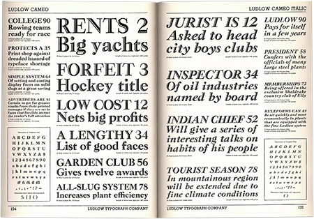
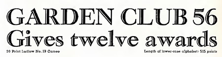
In the 1940s most newspapers used Ludlow Typograph typesetting machines for setting headlines, using matrices specific to those machines. The Ludlow company produced these matrices for a wide range of typefaces and sizes. I have looked through Ludlow type specimen books online, and found one with the type used on our photograph—a hand-tooled serifed Roman named Cameo.
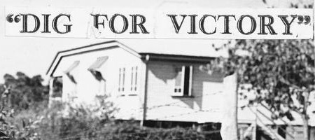
So the purple label should read Ludlow Cameo type. More usefully, it should add the tag dig for victory which is a very pithy expression of what the photo is about, and likely to connect this image with many others about the same subject. Like this:

Postscript 1 April 2019: I see that the library’s web page inviting people to Pitch In and tag photos in Flickr Commons has been removed, and replaced with this one.
Old Museum Stories
Today the Old Museum Stories website went live. It is designed as a forum for people to share stories about one of Brisbane’s favourite historic places—a place that, since 1863, has been the site of horticulture, recreation, education, performance, and conviviality. Go on, add your story now.