Marking time in February 2004
Diderot online
If you don’t have easy access to Denis Diderot’s Encyclopédie you might like to know it is being published on the web by the University of Chicago. This is from the website introduction:
The “Encyclopédie ou Dictionnaire raisonné des sciences, des arts et des métiers, par une Société de Gens de lettres” was published under the direction of Diderot, with 17 volumes of text and 11 volumes of plates between 1751 and 1772. Containing 72,000 articles written by more than 140 contributors, the “Encyclopédie” was a massive reference work for the arts and sciences, as well as a “machine de guerre” which served to propagate the ideas of the French Enlightment. The impact of the “Encyclopédie” was enormous. Through its attempt to classify learning and to open all domains of human activity to its readers, the “Encyclopédie” gave expression to many of the most important intellectual and social developments of its time.
You can search the text. Here are some French terms you might find useful: Charpenierie (carpentry); Menuisier en meubles (furniture maker); Tourneur et tour a figure (turner); Taillandier (screw maker); Coutelier (cutler).
New Zealand sabbatical
In early April I’m off to New Zealand with Margie and our two girls. For four months. While Margie does a stint at the National Library in Wellington, I’ll cook, clean, and look after children.
Some other things I might do:
Stuffed fish
The Victorian Taxidermy Company Limited is offering a collection of fish cases for sale—including the famous Marston Pike:
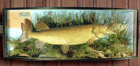
The case contains the remarkable true story of Marston who whilst fishing with a dry fly hooked a small Trout (1½ lb) that was subsequently caught and half swallowed by a large pike, and the battle commenced. Marston successfully landed both fish and had them mounted in full action pose, including the original tight line and fly in the trout’s mouth. “Halfway through the fight” Marston wrote, “the Pike saw me and tried to spit the Trout out” Marston continued his deadly game, adding “I thought, if I can nurse you my friend, I might get you as well”.
Provenance: R B Marston the legendary and most esteemed angler and editor of the Fishing Gazette reported his tale in his own paper and requested that the article along with the papers header, his signature, and date be built into the case by Coopers.
Further notes together with an illustration of the case also appeared in the Fishing Gazette seven years later 9th August 1919. For further reference see Buller Fred: The Doomsday book of mammoth Pike, 1979. The case having been on loan for many years to Buller’s shop in Aylesbury.
New York bohemians
Here’s a sequel to my reference to New York rats: a feature in the Morning News which maps the haunts of New York bohemians.
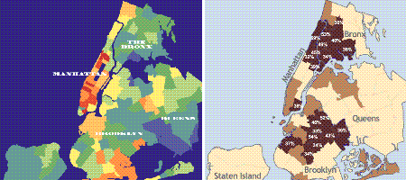
It’s interesting to compare the relative spatial distribution of the rats and the bohemians, and to ponder the reasons.
A parcel from Thailand
Writing about last month’s special place sent me casting the net for the books of Dr Jaroslav Poncar. There is one at the State Library of Queensland (hidden away in the stacks), and another in the Queensland University of Technology Library (at a campus on the other side of town).
Amazon has some of his books, but not the one I found in a Bangkok bookshop.
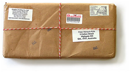
My copy arrived today, in a brown paper package tied up with string. Not like one of those parcels you get from amazon.com. I’m too busy to read books at the moment, so it can stay wrapped. Oh yeah, that’s right.
Shooting the courier
Thanks to typographica for pointing out a report on the ABC website:In a sign that no matter is too small to affect international diplomacy, the US State Department has issued an edict banning its longtime standard typeface from all official correspondence and replacing it with a “more modern” font.
In an internal memorandum distributed on Wednesday, the department declared “Courier New 12”—the font and size decreed for US diplomatic documents for years - to be obsolete and unacceptable after February 1.
In response to many requests and with a view to making our written work easier to read, we are moving to a new standard font: ‘Times New Roman 14’, said the memorandum.
I have admired both of these typefaces for a long time. When I first used IBM Selectric typewriters in the 1960s (yes, I am that old) Courier was my choice. It was clean and readable, despite the limitations of fixed pitch.
The older Times New Roman is a fine font, well suited for cramming words into narrow newspaper columns. Sir Cyril Burt introduces it in his little book ‘A psychological study of typography’ (London: Cambridge University Press, 1959):
On 3 October 1932, [The Times] arrived at the breakfast table set in an entirely new type, specially designed by Mr Stanley Morison (sometimes Sandars Reader in Bibliography in the University of Cambridge, and Typographical Adviser to the Cambridge University Press). A year later the design was released for general use. Here we no longer have a revival or readaptation of an old historic face, but a twentieth-century type, equal in merit (if our results can be trusted) to those of the classical designers of the best periods. At the present day it is probably more widely used than any other face. For its original purpose, to combine legibility with economy of space, it is admirably suited—large on its body, compressed in spite of its x-height, yet with well open counters, and furnished in its original form with short space-saving ascenders and descenders. We found it amazingly legible in the smaller sizes. The reader [of the book, that is — not of this website] has it before him, in 11-point, leaded 2 points, with footnotes in 7-point, leaded 1 point.
I have a copy of Professor Burt’s monograph—a discard from the State Library of Queensland. I enjoy its pedantic exposition, its formal design, its high quality letterpress printing, and its dark blue cloth binding with gold blocked spine title. It shows off Times New Roman nicely, in a 1959 British way.
But this is 2004, and we have moved on from cast metal type and letterpress printing. What led the State Department to choose Times New Roman? Probably plain ignorance and insensibility, I guess.