Marking time
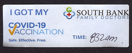
Vaccination
Diary note: This morning I received my first dose of AstraZeneca Covid-19 vaccine. I walked out of the clinic with this new label on my shirt.
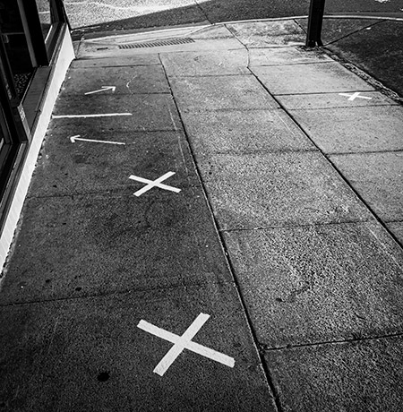
Footpath ephemera
I took a photo of some arrows and crosses marked with tape on a footpath outside a local cafe—a snapshot of the choreography of social distancing in these COVID-19 times. In the future, perhaps, a photo of these marks will be a curiosity, a puzzle.
Seeing these marks on the ground reminded me of something from my childhood. In mid-1957, as an eight-year-old, I transferred to Kenmore State School. It was a one-teacher school then, where all the pupils, about 40 of us ranging from Grade One to Grade Six, sat in the same room at six-seater desks. Each morning we assembled in rows outside the classroom, in the same arrangement as our desks inside. A grid of wooden pegs driven into the ground, and barely protruding above the grass, marked exactly where each of us was to stand.
As we stood to attention on our marks, the teacher made announcements and exhortations from the verandah. Then, row by row, we marched up the stairs, across the verandah, and into our places in the classroom to the strains of the Colonel Bogey March played on a gramophone.
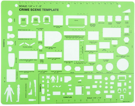
Crime scene template
Amazon.com sent me a message, with new recommendations for you based on your browsing history. Among the recommended items was a Crime Scene Drawing Template (Thoroughly Capitalized In That Annoying American Style).
Is this something I should add to my kit of tools for recording heritage conservation crimes?
Burra Charter video
My colleagues at Australia ICOMOS have dug out this old video and posted it on YouTube.
I had a part in making that video, which was originally distributed on VHS video cassettes, before YouTube was a thing. My first involvement was in 1993 when I drafted a pitch that Australia ICOMOS used to raise funds for the project.
It took a few years to get going. In 1999 ICOMOS engaged me to help again. I advised on script development, focussing on communicating useful messages about conservation. I also appeared in two of the segments—do as much as necessary, but as little as possible (Newstead North shearing shed, near Inverell), and listen to the community, appreciate cultural differences (Musgrave Park, South Brisbane).